Ranking and reviewing the new PWHL team names and logos
By Maggie Hsu, September 21 2024—
The Professional Women’s Hockey League (PWHL) is back for its second season after a very successful inaugural season. With the excitement of a new season comes the much-anticipated reveal of the team names and logos. Each team has crafted a unique identity that not only represents the spirit of the cities they call home but also embodies their passion for hockey.
Branding, including logos and team names, plays a crucial role in hockey and sports. Fans want to be able to identify with their team, proudly wearing their logo on merchandise and memorabilia. A well-designed logo and a catchy team name can last forever — just look at the NBA store still selling merchandise for the now-defunct Vancouver Grizzlies.
With that in mind, let’s dive into how well these new PWHL team names and logos represent their respective cities, ranking them from six to one.
6. Toronto Sceptres
“The ‘Sceptres’ embody Toronto’s regal history and commanding presence, reflected in the moniker Queen City and iconic places like Queen Street — one of the city’s most culturally vibrant thoroughfares — connecting diverse neighbourhoods and showcasing Toronto’s rich heritage. The ornamented Sceptre itself is a symbol of power and strength found in courts and palaces,” reads a statement on the PWHL website.
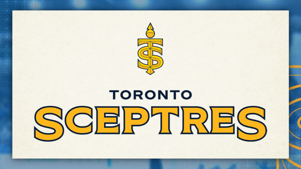
The introduction of a golden yellow into Toronto’s sports palette, traditionally dominated by blue and white, is a welcome change. I appreciate that it also represents the city of Toronto well with a nod to iconic Queen Street. However, in an era where many teams are distancing themselves from historical ties to colonialism, the sceptre might feel out of place. While it honours the power of female monarchs, there could have been a more thoughtful approach to the symbolism.
And let’s be honest — the memes making comparisons to Taylor Swift’s “Shake it Off” music video where she has her TS logo on a cheerleading uniform are hard to ignore.
5. Ottawa Charge
“‘Charge’ pays tribute to Ottawa itself: from the city’s motto “Advance – Ottawa – En Avant”, nodding to its constant state of dynamic growth and forward progress as Canada’s Capital City,” reads a statement on the PWHL website.
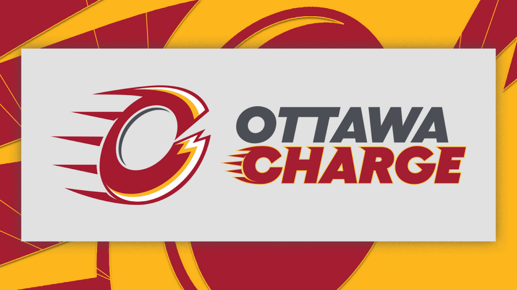
The name offers countless social media caption opportunities, but it loses points for its lack of originality. The name evokes comparisons to the NFL’s Los Angeles Chargers and the NBA G-League’s Cleveland Charge, making it feel less unique. The logo, with its red monogram ‘O’ brimming with energy, is visually striking but bears a resemblance to the Calgary Flames’ flaming C, which detracts from its distinctiveness.
4. New York Sirens
“‘Sirens’ is an ode to New York City’s one-of-a-kind energy, pace and rhythm — embodying the City’s sounds and people. Sirens also speaks to the sweet sound of the goal horn after the puck goes into the net,” reads a statement on the PWHL website.
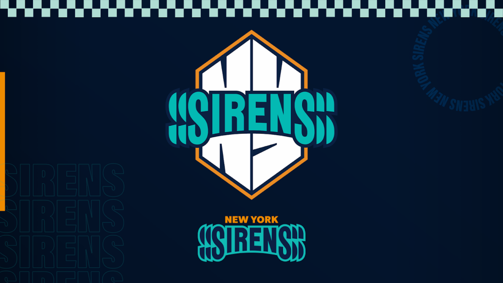
First of all the visualization of vibrations around their name is a huge mark of creativity from the graphic design team. It’s a nod to the energy of their fans. It’s rare to see a name pay such a direct tribute to their fanbase and it will forever tie the fans to the team.
“It’s about the energy of the City. There’s this vitality to it. It just makes you feel alive,” says Hockey Hall Fame inductee Jayna Hafford, the PWHL’s Senior Vice President of Hockey Operations in the Sirens’ press release.
Second, the colour palette is stunning. I think the Seattle Kraken turned me into a fan of teal in sports jerseys but it’s such a bold yet subtle colour.
Lastly, the name itself is said to be an homage to the goal horn that will hopefully be lit up every game by their players but I love the triple entendre laying in the name. Hailing from New York, a city so loud and is stereotypically known to have sirens blaring through the city at all times due to the population. But I’d like to think they were named after the mythological sirens.
3. Boston Fleet
“‘Fleet’ pays homage to Boston’s collective spirit and rich maritime history, representing the city’s unified strength and resilience,” reads a statement on the PWHL website.
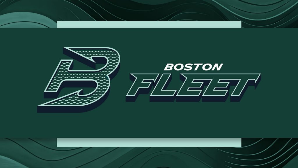
Okay, I said teal changed my life but this green palette is iconic. I love that the name pays homage to the city’s history while also giving a nod to Bostonians’ grit and strength. The logo itself is minimalist but the details in shaping the B like an anchor and having the waves motif inside of the B is beautiful as well. I can’t wait to hear the announcers say “And here comes the Fleet” whenever they break into the offensive zone.
2. Minnesota Frost
“‘Frost’ embodies the State of Hockey’s deep-rooted love for the ice — and the sport that has become a timeless tradition, bridging generations,” reads a statement on the PWHL website.
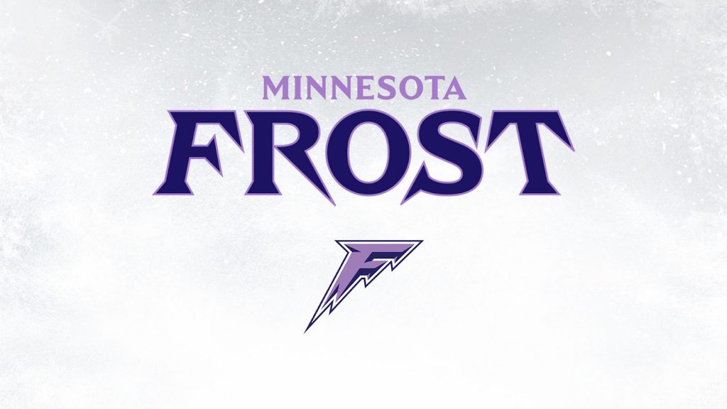
The purple in the branding is a rare and iconic choice, adding a touch of fierceness to the team’s identity. Minnesota, known as the State of Hockey, lives and breathes the sport, and ‘Frost’ complements the state’s other professional teams — Wild, Vikings, Timberwolves, Lynx — beautifully. The logo’s simplicity belies its effectiveness, representing the team, name, and brand with icy precision. This brand has endless potential for social media, capturing the essence of Minnesota’s hockey culture.
1. Montréal Victoire
“‘Victoire’ embodies Montréal’s joyously competitive spirit, acting as inspiration for the city to climb to even greater sporting heights. Win or lose, ‘Victoire’ is a mindset, celebrating the city’s pursuit of achievement,” reads a statement on the PWHL website.
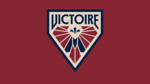
‘Victoire’ is a name with a legacy, and if any team can bear it, it’s Montréal’s. The name embodies the city’s rich history of winning, and the use of the feminine form of ‘Victoire’ is a powerful nod to the women who will continue this legacy. The logo is a masterpiece of simplicity and detail. The V figure evokes both the victory sign and the wings of the Goddess of Victory, Nike, while a hidden ‘M’ and a subtle fleur-de-lis honour Montréal’s cultural heritage and its place within Québec. These elements create a brand that is not only beautiful but also deeply meaningful, perfectly representing the city’s competitive spirit and rich history.